Comet Roof - Strengthening Comet’s Brand Presence Through Integrated Marketing Design
The Challenge: Bringing Corporate and Product Excellence Into Focus
PT Comtech Metalindo Terpadu (Comet) is an established metal roofing manufacturer offering products that combine functional advantages with modern minimalist design. While the company had built its expertise and developed a distinctive product range, these strengths could be communicated more clearly through its company profile and product catalog.
The existing materials provided a foundation for presenting Comet and its products, but their information structure and visual approach did not fully reflect the brand’s modern minimalist direction. Comet needed a more cohesive communication system that would make its company advantages easier to understand, its product range easier to navigate, and its identity more consistent across marketing materials.
The Strategy: Restructuring Marketing Tools Around Their Purpose
Designata restructured Comet’s marketing materials around the specific role each tool needed to fulfill, creating a more purposeful approach to communicating the company’s strengths and products.
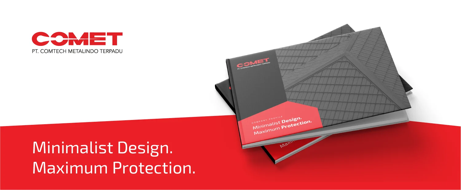
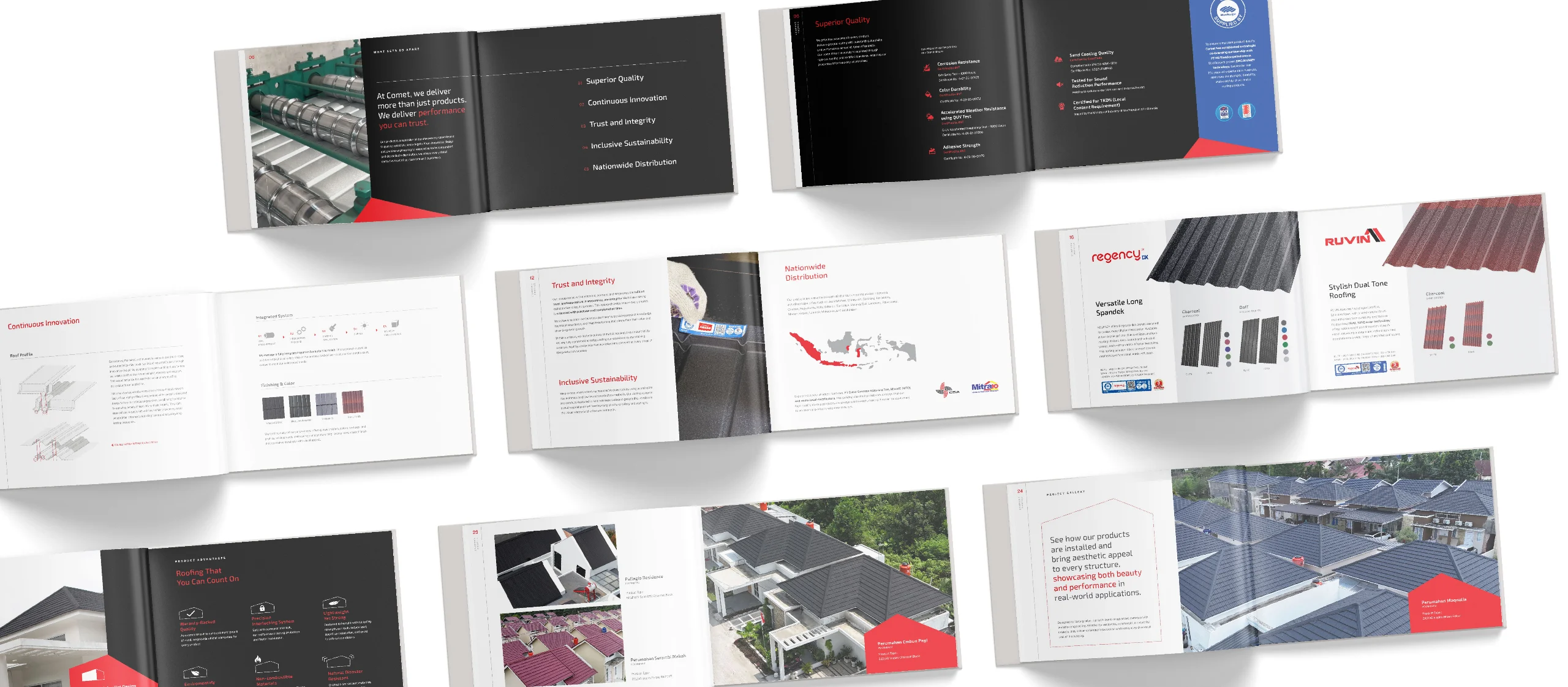
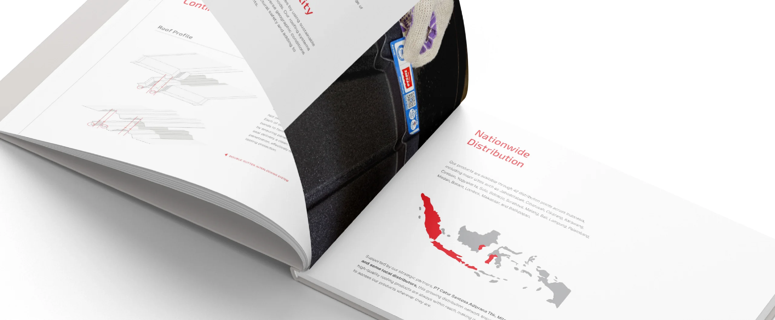
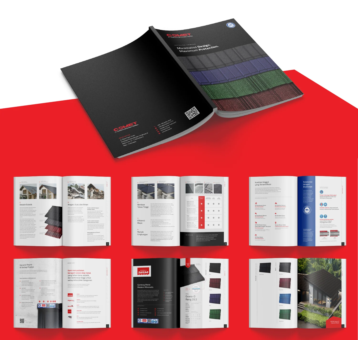
The company profile placed Comet’s advantages and expertise at the center of the narrative, summarized into easily understandable points, giving audiences clear reasons to consider the company as a metal roofing partner. The products list and advantages were then briefly mentioned, as well as the projects Comet has done, providing supporting context to build a fuller understanding of its capabilities.
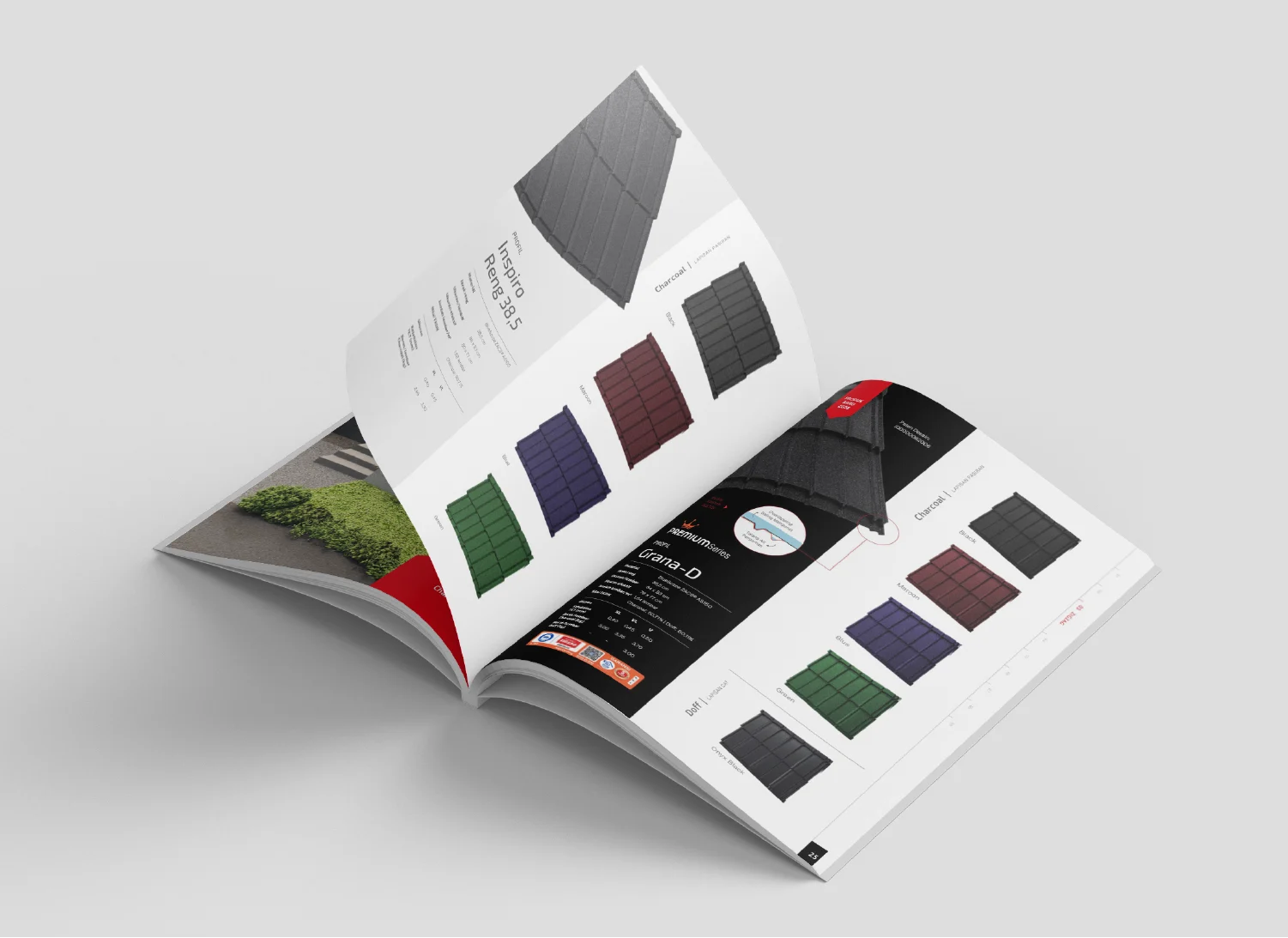
The product catalog took a more detailed, product-oriented approach. Product advantages were explained more thoroughly, while the hierarchy of brands, roof profiles, finishes, and color options was structured to make browsing, comparing, and selecting products more straightforward. Project references and product certifications further supported the presentation of Comet’s experience and product quality.
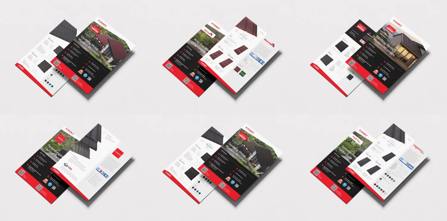
Beyond these core materials, flyers and a calendar extended the brand’s communication to other touchpoints. The flyers distilled key product information into a more concise format, making them suitable for wider distribution and helping introduce Comet’s offerings to potential customers.
The calendar was designed to communicate singular focused message. As the first calendar following the visual refresh, it showcases Comet's roofing options across profiles, colors, and finishes. Shaped like a modern minimalist house, the calendar helped audiences visualize how Comet’s metal roofing would look on and blend seamlessly with contemporary architecture. Its foldable design also made shipping and installation more practical.
Visual Manifestation: Minimal Design, Strong Protection
Comet combines minimalist product design with superior protection—a distinctive strength that sets the brand apart. Inspired by this philosophy, Designata developed a visual system that reflects the same balance of simplicity, strength, and functionality.
Clean layouts, generous white space, and solid typography establish a modern and confident appearance. A distinctive geometric element inspired by the shape of a roof creates a recognizable visual signature, while Comet’s contrasting black, red, and white corporate colors reinforce its bold personality and willingness to stand apart.
To further connect the visual identity with the products, realistic 3D renderings showcase Comet’s roofing solutions on modern houses and buildings. These visualizations help audiences appreciate how the products complement contemporary architecture while communicating the brand’s commitment to both aesthetics and protection.
Strategic Impact: A Stronger and More Recognizable Brand Presence
The restructured marketing materials give Comet a clearer way to communicate its expertise, present its product advantages, and support customers throughout the product selection process. Each tool now serves a more defined purpose, helping professional buyers and end customers understand the company and navigate its offerings with greater clarity.
Across the company profile, catalog, flyers, and calendar, a unified visual system brings consistency to Comet’s brand expression. This consistency strengthens the connection between Comet’s visual presence and its modern minimalist positioning, providing a stronger foundation for brand recognition and a more cohesive market presence.