Kaila - Repositioning an Existing Personal-Care Brand for the Skincare Market
Kaila was originally developed as a personal-care brand, with its previous branding development also created by Designata. As the business evolved and shifted its focus from toiletries and body care toward a more dedicated skincare portfolio, the brand needed to evolve with it.
Our work covered brand strategy, logo redesign, visual identity, packaging design, and packaging system.
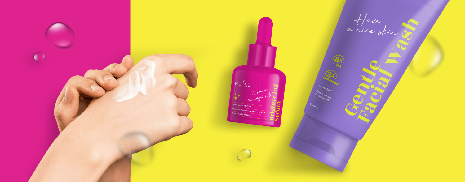
The new Kaila was positioned for a younger middle-market audience with a confident and expressive attitude. Instead of adopting the soft, minimal visual language commonly seen in skincare, we created a bolder personality that reflects consumers who are comfortable standing out and expressing themselves.
The redesigned logo combines simplicity with stronger character, creating a more contemporary identity that works consistently across a growing skincare range.
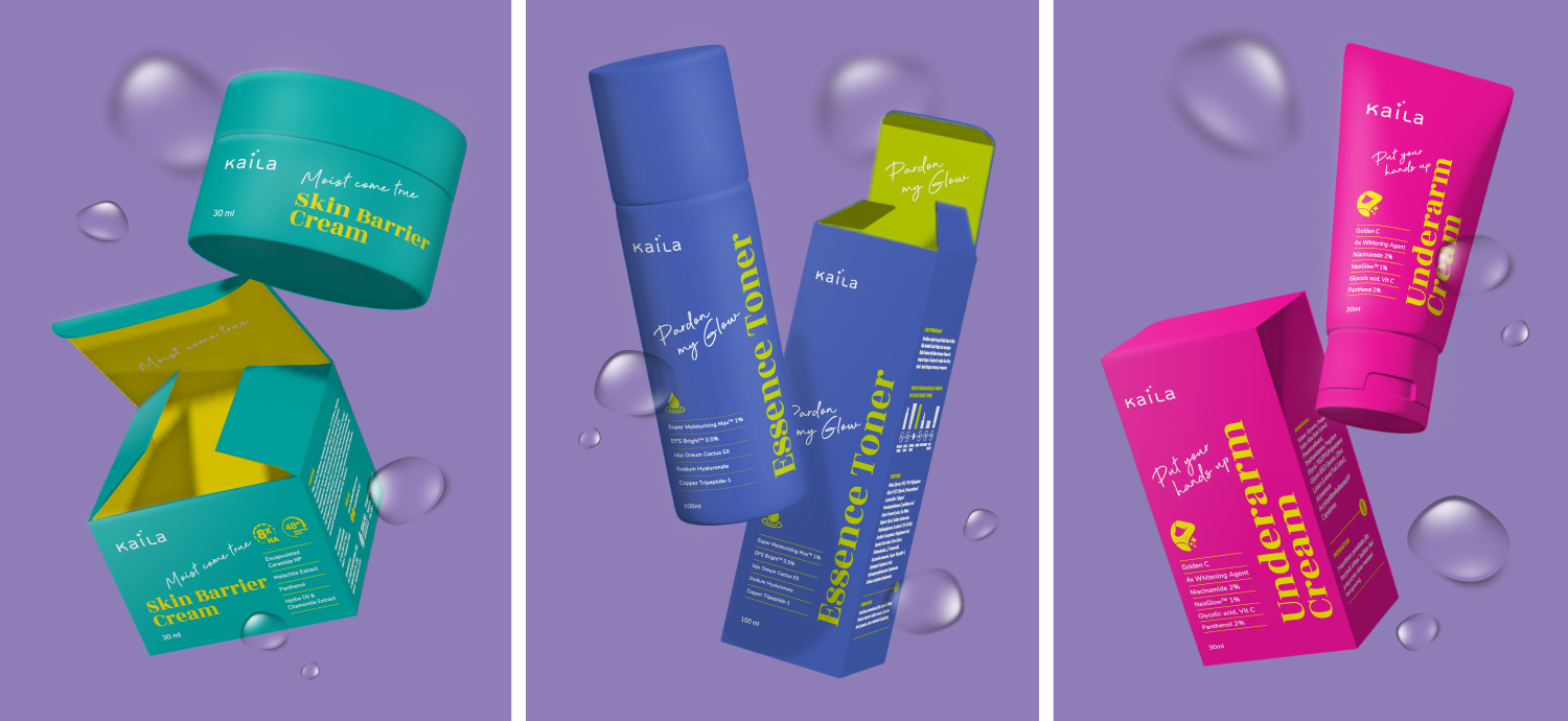
Making Each Formula Easy to Recognize
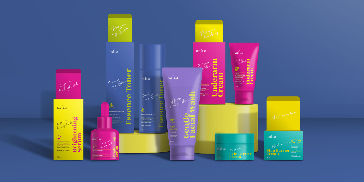
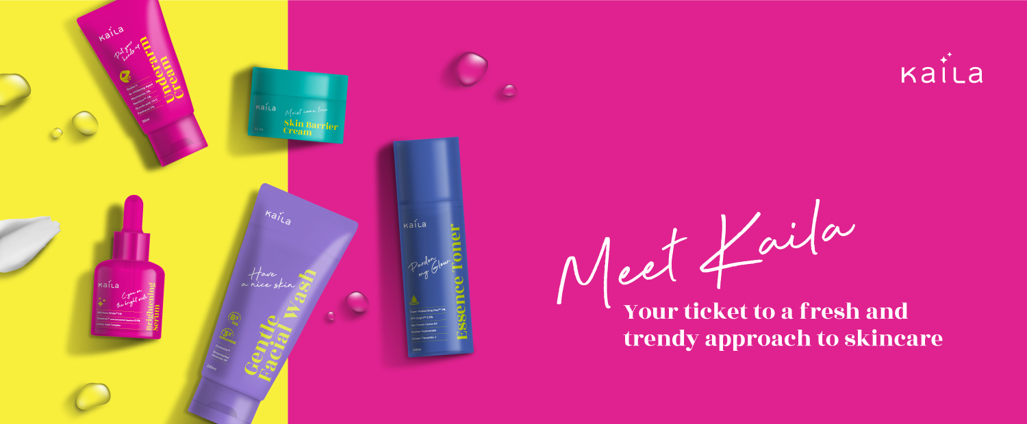
Kaila’s skincare products are differentiated by their individual formulations and product benefits. The packaging therefore needed to make each variant distinctive without fragmenting the overall brand.
We developed a high-contrast color system that gives each product a strong individual identity while maintaining a recognizable Kaila family across the range. Bold color combinations help the products stand out visually and make different variants easier to distinguish.
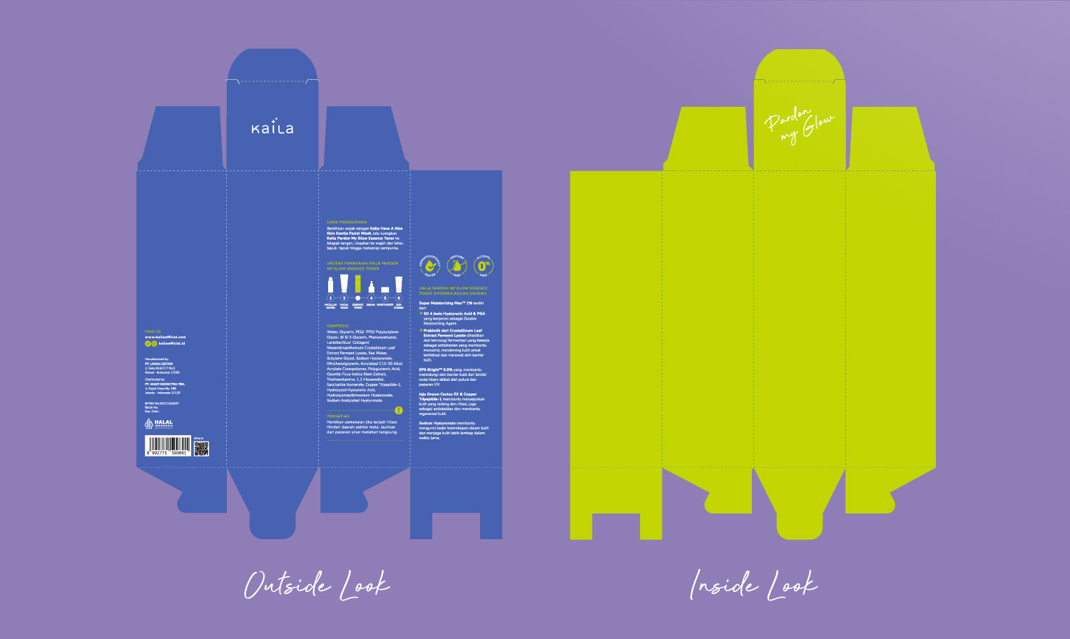
Typography, product-benefit communication, icons, and graphic elements were organized within a consistent packaging architecture, allowing key formulation and benefit information to remain clear even as the portfolio expands.
The result is a scalable skincare branding and packaging system that supports Kaila’s transition from personal care into skincare—giving the brand a more focused market position, a bolder personality, and a flexible visual system for future product development.