Pigeon Baby - Elevating baby bottle design through nature
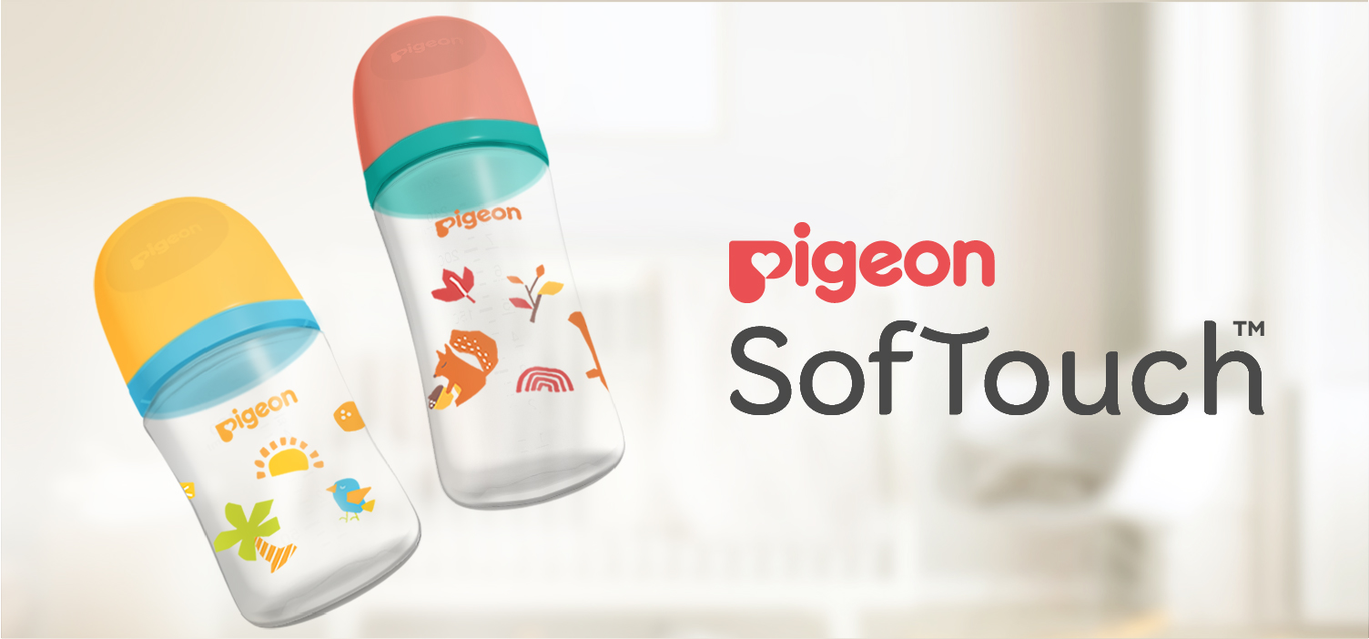
As part of our continuing collaboration with Pigeon Singapore, we have developed several illustration series for the Pigeon SofTouch bottle range. This ongoing relationship reflects the trust built through previous projects and our understanding of Pigeon’s visual standards, production requirements, and premium baby-care positioning.
For this particular series, Pigeon wanted to create a more premium and distinctive bottle collection aimed at consumers who appreciate a more expressive and design-driven aesthetic.
We developed the concept around the Four Seasons—Spring, Summer, Autumn, and Winter—using a more unique and edgy illustration style while keeping the collection visually connected as one complete series.
Each season was given its own visual personality through different compositions, botanical elements, and color combinations. At the same time, the illustration system was carefully controlled so the four designs remained recognizably part of the same Pigeon SofTouch collection.
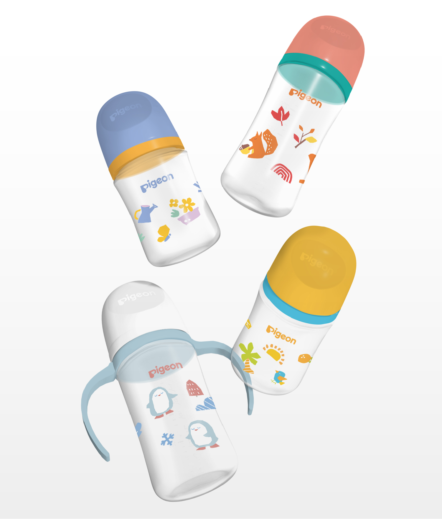
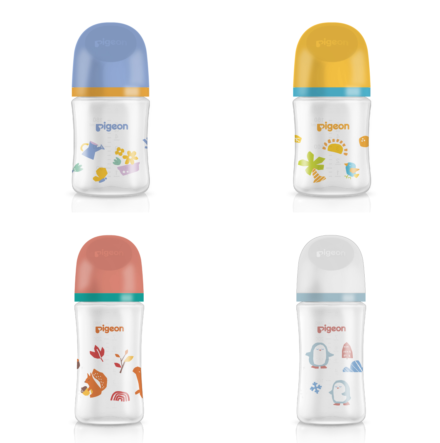
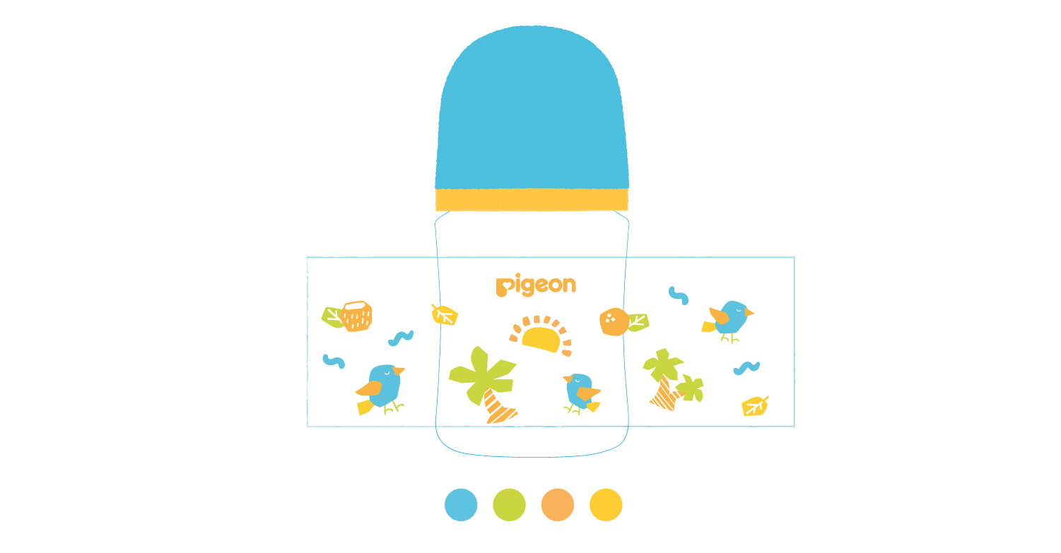
A major challenge came from the bottle-printing process. The artwork was limited to a maximum of four solid printing colors with no gradients, requiring the illustrations to be developed specifically around the technical limitations of direct bottle printing.
Rather than simplifying the artwork excessively, we carefully separated each illustration into printable color layers, considering how every color would be applied sequentially during production. This allowed us to preserve the smaller details, depth, and distinctive character of the illustrations while keeping the final artwork technically feasible and consistent for mass production.
The overall color composition also had to work together with the bottle cap and cover colors. These physical components were treated as part of the visual system, ensuring that the illustration, bottle, cap, and closure formed one cohesive design rather than appearing as separate elements.
The result is a premium illustrated baby bottle series that combines expressive seasonal storytelling with the precision required for industrial production—demonstrating how illustration, color, packaging components, and print technology can work together within a single coherent design system.